Skip to content
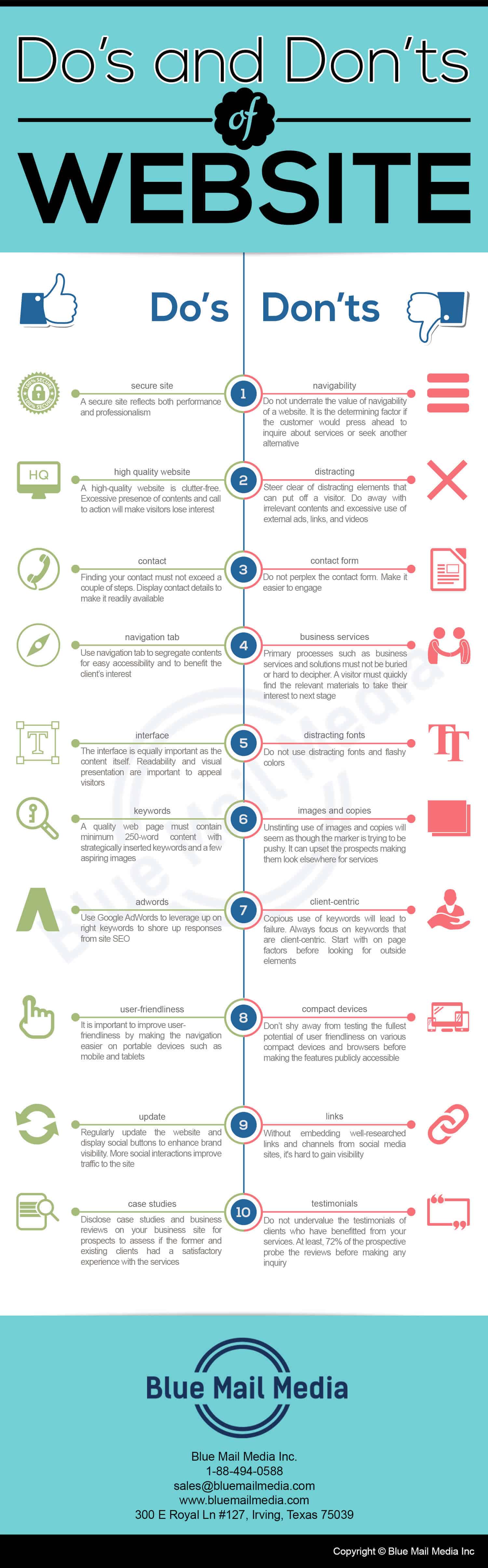
Do’s
- A secure site reflects both performance and professionalism.
- A high-quality website is clutter-free. Excessive presence of contents and call to action will make visitors lose interest.
- Finding your contact must not exceed a couple of steps. Display contact details to make it readily available.
- Use navigation tab to segregate contents for easy accessibility and to benefit the client’s interest.
- The interface is equally important as the content itself. Readability and visual presentation are important to appeal visitors.
- A quality web page must contain minimum 250-word content with strategically inserted keywords and a few aspiring images.
- Use Google AdWords to leverage up on right keywords to shore up responses from site SEO.
- It is important to improve user-friendliness by making the navigation easier on portable devices such as mobile and tablets.
- Regularly update the website and display social buttons to enhance brand visibility. More social interactions improve traffic to the site.
- Disclose case studies and business reviews on your business site for prospects to assess if the former and existing clients had a satisfactory experience with the services.
Don’ts
- Do not underrate the value of navigability of a website. It is the determining factor if the customer would press ahead to inquire about services or seek another alternative.
- Steer clear of distracting elements that can put off a visitor. Do away with irrelevant contents and excessive use of external ads, links, and videos.
- Do not perplex the contact form. Make it easier to engage.
- Primary processes such as business services and solutions must not be buried or hard to decipher. A visitor must quickly find the relevant materials to take their interest to next stage.
- Do not use distracting fonts and flashy colors.
- Unstinting use of images and copies will seem as though the marker is trying to be pushy. It can upset the prospects making them look elsewhere for services.
- Copious use of keywords will lead to failure. Always focus on keywords that are client-centric. Start with on page factors before looking for outside elements.
- Don’t shy away from testing the fullest potential of user friendliness on various compact devices and browsers before making the features publicly accessible.
- Without embedding well-researched links and channels from social media sites, it’s hard to gain visibility.
- Do not undervalue the testimonials of clients who have benefitted from your services. At least, 72% of the prospective probe the reviews before making any inquiry.