

Every visitor to your website is an opportunity of getting a qualified lead. But, for that, you first need to make that user stay on the website.
Now, what makes a visitor stay on your company web page – be it a landing page, a blog or the homepage?
It’s the user experience (UX) that you deliver through your website:
- The website should be capable enough of satisfying all the quests of your visitors.
- It should also be engaging enough to make them scroll from one page to another and to switch from one tab to another, satisfactorily.
However, when it comes to B2B marketing, the job is easier said than done!
A B2B buying journey is long and complicated. Many people with different roles are a part of one buying decision. Thus, aligning the website UX with the needs, interests, and perspectives of each included in the buying process becomes a tough task.
So, what can be the best way to winning a website UX? Below are the 5 B2B brands that are great at website user experience along with the reasons that have made them so:
1. Salesforce
When it comes to website user experience, Salesforce seems to have mastered it. Here’s what makes it more successful than others:
- Enticing customer success stories within its communities
- Excellent content pieces
- Design
The biggest USP of the CRM software company Salesforce is the success stories it creates within its communities. It just not sells the products, but also tells stories about the success of their clients. These clients are known as Trailblazers. They also have a tab showing success stories of their clients that own small businesses.
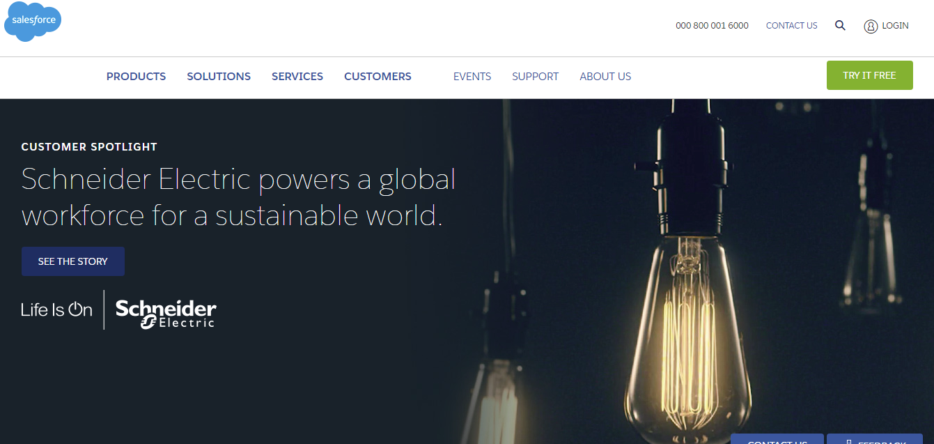
(Source: Salesforce)
Salesforce blog adds to the website UX of the brand. One can find excellent content about marketing, technology, and research pieces.
2. Slack
If you want to engage your B2B users, you don’t always have to go fancy with your company web pages. Simplicity in design and color can also do it better. Slack proves it through its website with:
- Simple but appealing images
- Clear CTA
- Color combinations
- Large fonts
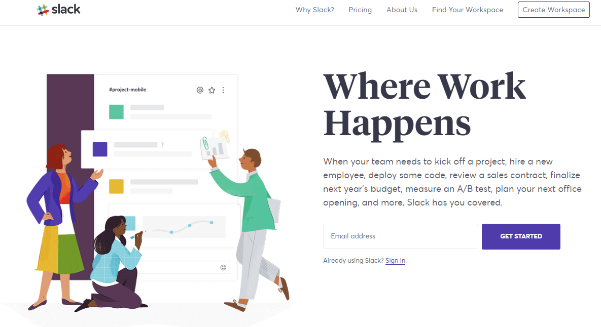
(Source: Slack)
You won’t find much of visuals and fanciful designs on Slack’s website. Their CTAs are clear, placed correctly and thus steal the direct attention of the users.
3. HubSpot
HubSpot is one of the big guys when we talk of the B2B brands that excel in website UX. The reasons are:
- Brilliant marketing content
- Simple and clear CTA
- Success stories
- Subtle colors
If the homepage of a website tells what exactly the brand does, users are more likely to stay with it for longer. The website of HubSpot shows the same.
Go to the HubSpot website, and you will see that it always talk to-the-point and that too each time very creatively. Hats off to its content marketing team!
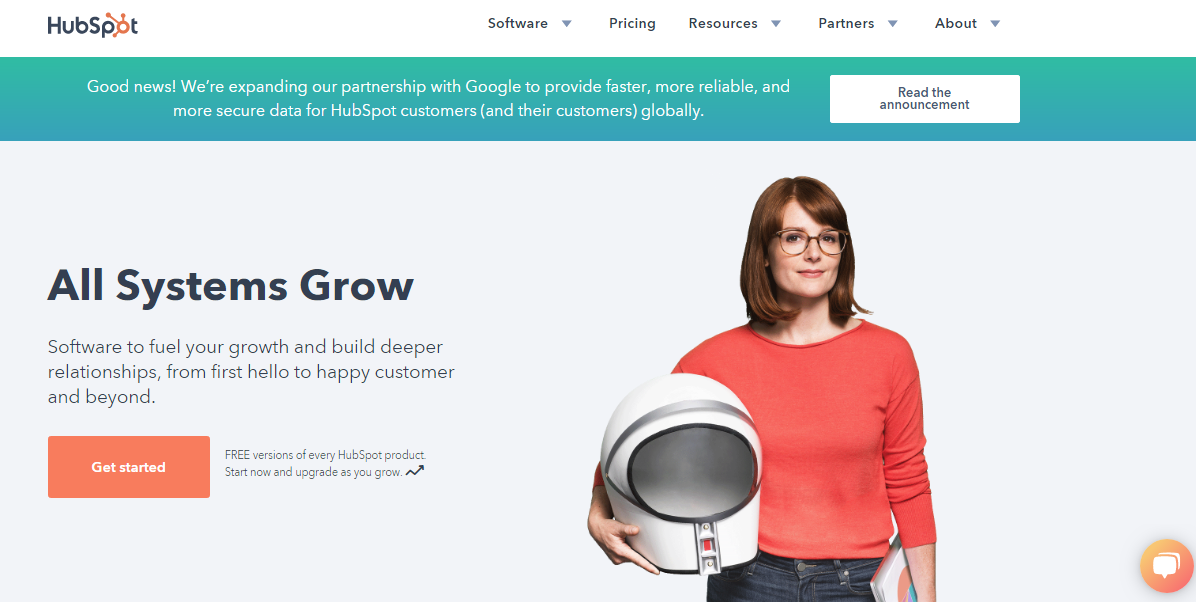
(Source: HubSpot)
From a subtle color combination to the right placing of the CTAs – it never fails to entice the audience.
4. Zendesk
Did you know that 90% of information that comes to the brain is visual?
People tend to memorize the information better and for a longer time when we present it to them in the form of interactive content. It can be images, GIFs, videos, interactive infographics, or animated videos on the website. And when the website provides great customer service, it adds to the UX.
Zendesk has used this fact beautifully. Here’s what makes it stand unique:
- Amazing animation
- Great customer support
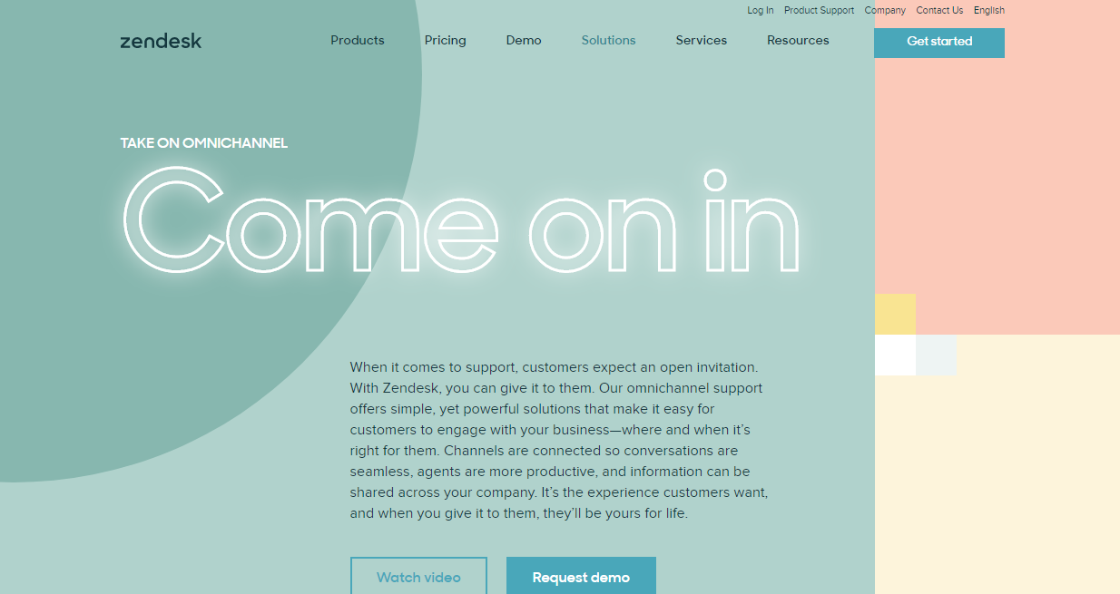
(Source: Zendesk)
The entire website of Zendesk is filled with impressive animations that if you land there, you can’t resist scrolling down and knowing more about the company.
5. Qualcomm
The technology company Qualcomm provides an innovative user experience from its website with:
- Unique storytelling styles
- Stories of invention
- Videos
- Large fonts
- Clear CTA
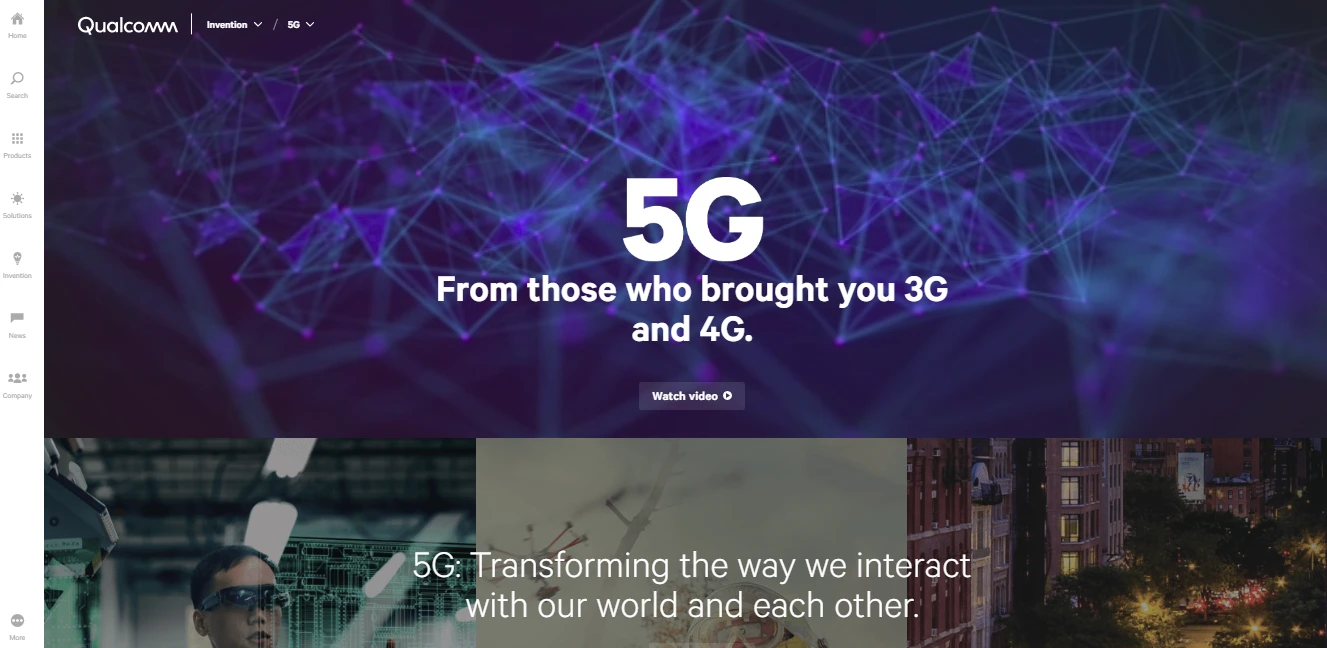
(Source: Qualcomm)
Qualcomm nails it with the content that moves in a conversational tone. If you go to its website, you’ll see interesting stories of innovation. There is a unique style of its stories. Then there are eye-catching images and videos throughout the website that explain the services of Qualcomm better.
This is how these B2B companies are nailing the UX and so can you! See what fits best to your brand and give it a try. No wonder, you too can become one on the list!